BRANDING

blu started with a 50k investment and was sold for 135m.
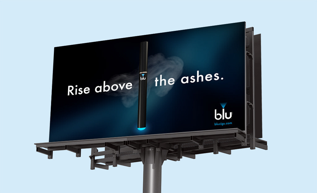
During the logo design process, I observed that the lowercase letter "l" resembled blu's black electronic cigarette. To enhance the connection, I incorporated an upside-down blue triangle with a gradient effect to simulate the unique blue light that emanates from the cigarette's end.
Primary Brand Colors
Secondary Brand Colors
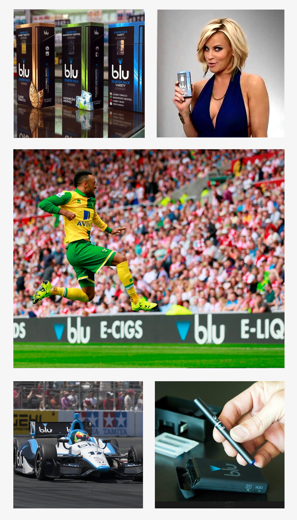
PACKAGING
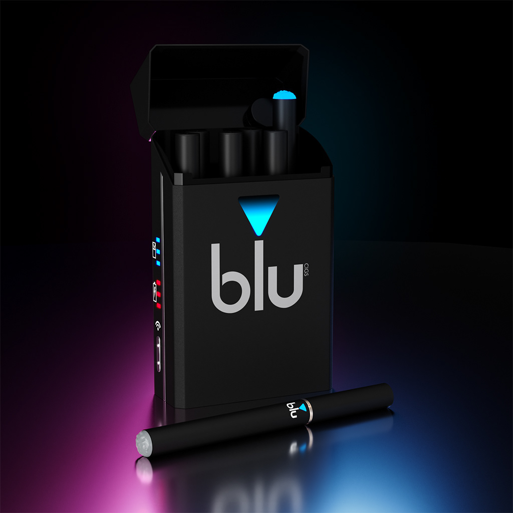
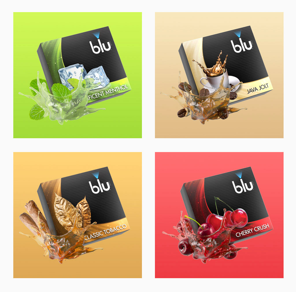
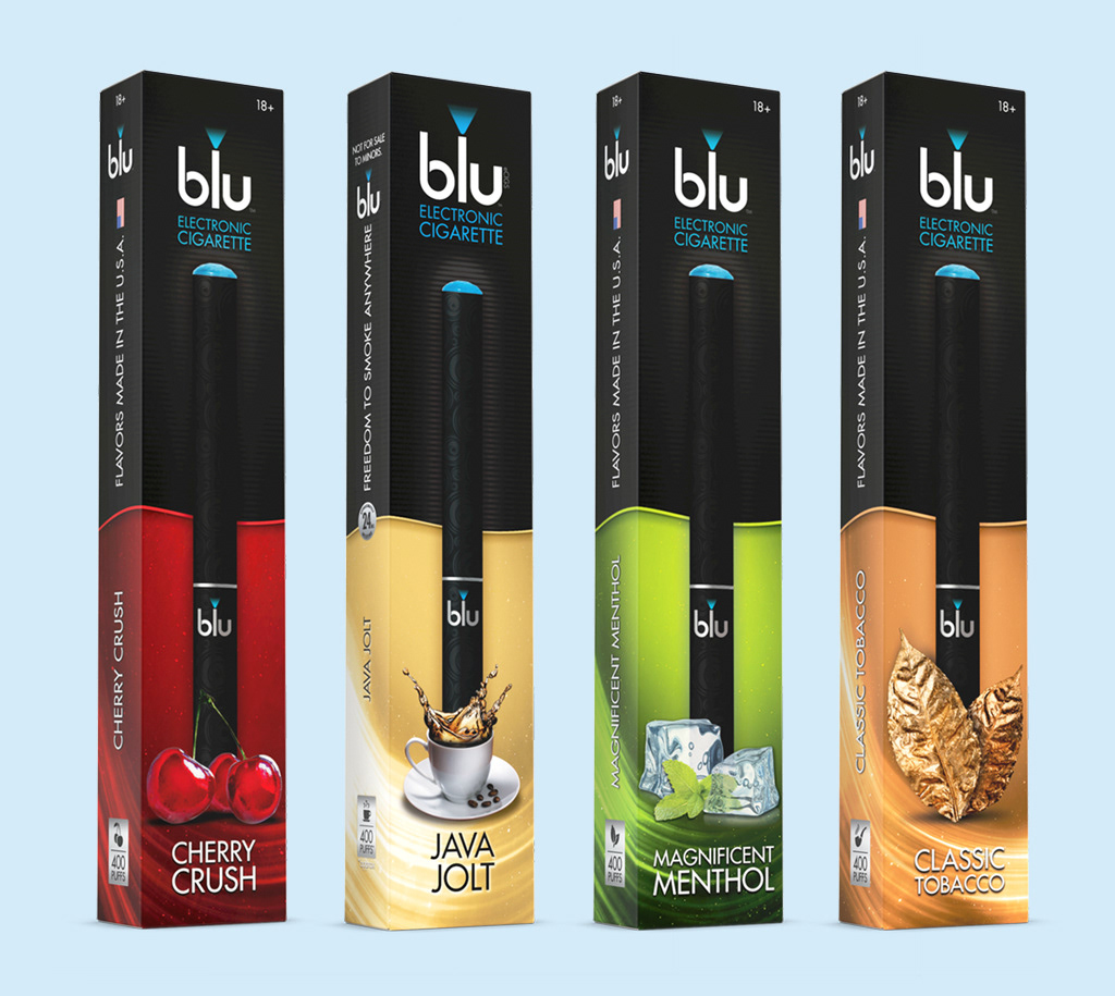
On the main packaging, I opted for a simple and sleek design with a black backdrop. The logo was the main focus, and it shone in a minimalistic and modern style. As for the flavor cartridges, I added a splash of color to represent the different flavors. I also included a swoop that conveyed the high-tech nature of the product.
DIGITAL
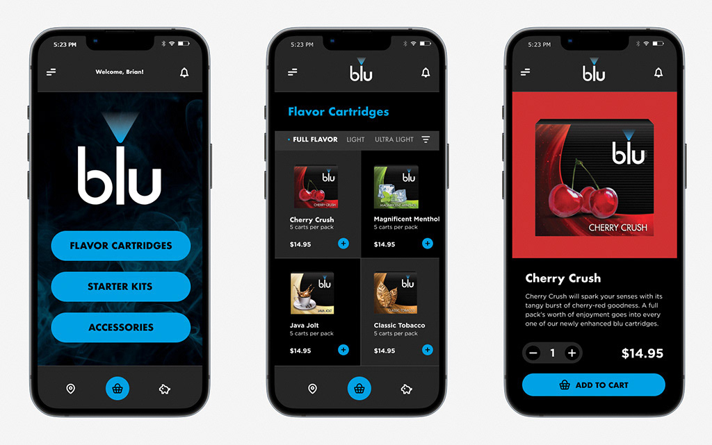
App Design
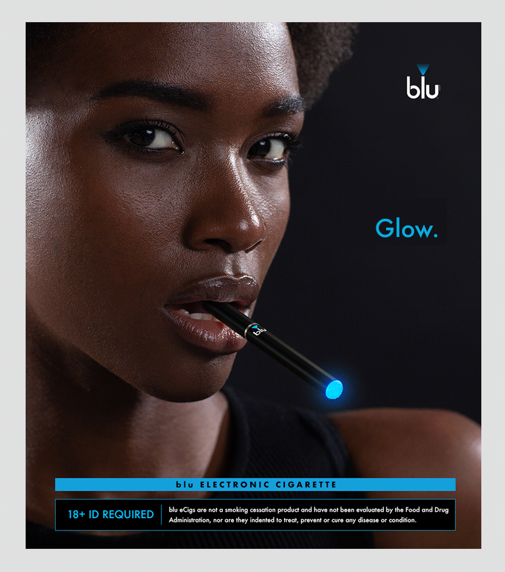
Display Ads

Landing Page
PRINT
Publications: Rolling Stone, Maxim, & Playboy.
Billboard
VIDEO BUMPER
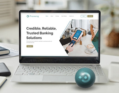
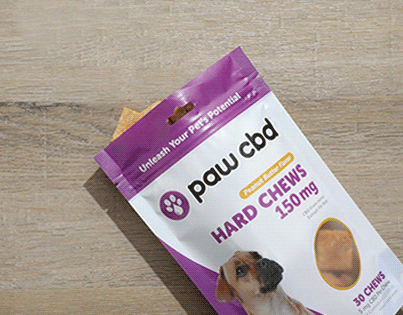
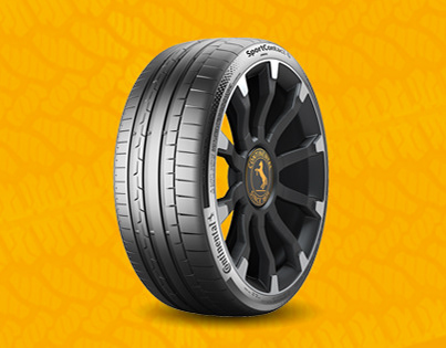
blu LIFESTYLE